TabFolder
Extends Composite
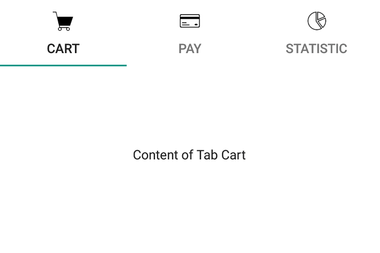
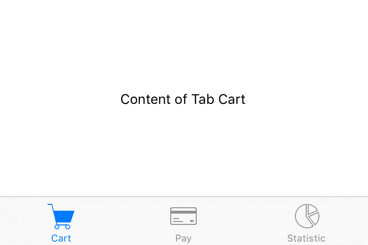
A widget that can switch between tabs. Only children of type Tab are supported. Since the TabFolder does not compute its own size, the width and height must be defined by the respective layout properties (e.g. either width or left and right must be specified).
Import this type with “const {TabFolder} = require('tabris');”
| Android | iOS |
|---|---|
 |
 |
Properties
paging
iOSAndroid
Type: boolean
Enables swiping through tabs. Always enabled on Windows.
selection
Type: Tab
The currently selected tab.
tabBarLocation
Type: string, supported values: top, bottom, hidden, auto, default: auto
The placement of the tab titles. When set to "hidden", the tab bar will not be visible. When set to "auto", the position is platform dependent.
This property can only be set on widget creation. Once set, it cannot be changed anymore.
tabMode
Android
Type: string, supported values: fixed, scrollable, default: fixed
Controls how the tabs make use of the available horizontal space. Setting the tabMode to "fixed" makes the tabs span the entire available space. In case of a very wide TabFolder the "fixed" mode centers the tabs. The mode "scrollable" left aligns the tabs and allows to scroll the tabs if there are more tabs than would fit in the available space. Available on Android only.
This property can only be set on widget creation. Once set, it cannot be changed anymore.
textColor
iOSAndroid
Type: Color
The color used for the text of the tab headers.
win_tabBarTheme
Type: string, supported values: light, dark, default, default: default
Controls the color scheme used for the tabBar. When set to "default" the theme is inherited from the TabFolder. Available only on Windows.
Events
pagingChanged
Fired when the paging property has changed.
Event Parameters
-
target: this The widget the event was fired on.
-
value: boolean The new value of paging.
scroll
iOSAndroid
Fired when paging is enabled and a tab is scrolled. The event parameter contains position information relative to the currently selected Tab. Eg.: scrolling a 500px wide tab 10% to the left sets offset to 50. Scrolling 10% to the right sets offset to -50.
Event Parameters
-
target: this The widget the event was fired on.
-
offset: number Number of pixels the current tab has scrolled horizontally.
-
selection: Tab The current value of the
selectionproperty.
select
Fired when the user taps on a tab. The event also fires when the same tab is tapped multiple times.
Event Parameters
-
target: this The widget the event was fired on.
-
selection: Tab The
Tapselected by the user.
selectionChanged
Fired when the selection property has changed.
Event Parameters
textColorChanged
Fired when the textColor property has changed.
Event Parameters
win_tabBarThemeChanged
Fired when the win_tabBarTheme property has changed.
Event Parameters
-
target: this The widget the event was fired on.
-
value: string The new value of win_tabBarTheme.
Example
const {Tab, TabFolder, TextView, ui} = require('tabris');

// Create a swipe enabled tab folder with 3 tabs

let tabFolder = new TabFolder({
  left: 0, top: 0, right: 0, bottom: 0,
  paging: true // enables swiping. To still be able to open the developer console in iOS, swipe from the bottom right.
}).appendTo(ui.contentView);

createTab('Cart', 'resources/cart.png', 'resources/cart-filled.png');
createTab('Pay', 'resources/card.png', 'resources/card-filled.png');
createTab('Statistic', 'resources/chart.png', 'resources/chart-filled.png');

tabFolder.on('selectionChanged', ({value: tab}) => console.log(`selection changed to ${tab.title}`));

function createTab(title, image, seletedImage) {
  let tab = new Tab({
    title: title, // converted to upper-case on Android
    image: {src: image, scale: 2},
    selectedImage: {src: seletedImage, scale: 2}
  }).on({
    appear: ({target}) => console.log(`${target.title} appeared`),
    disappear: ({target}) => console.log(`${target.title} disappeared`)
  }).appendTo(tabFolder);
  new TextView({
    centerX: 0, centerY: 0,
    text: 'Content of Tab ' + title
  }).appendTo(tab);
}

