CheckBox
Extends Widget
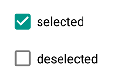
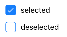
A check box widget.
Import this type with “const {CheckBox} = require('tabris');”
| Android | iOS |
|---|---|
 |
 |
Properties
checked
Type: boolean, default: false
The checked state of the check box.
checkedTintColor
iOSAndroid
Type: Color
The color of the selectable area in checked state. Will fall back to tintColor if not set.
text
Type: string
The label text of the check box.
textColor
Type: Color
The color of the text.
tintColor
iOSAndroid
Type: Color
The color of the selectable area.
Events
checkedChanged
Fired when the checked property has changed.
Event Parameters
-
target: this The widget the event was fired on.
-
value: boolean The new value of checked.
checkedTintColorChanged
Fired when the checkedTintColor property has changed.
Event Parameters
-
target: this The widget the event was fired on.
-
value: Color The new value of checkedTintColor.
select
Fired when the check box is checked or unchecked by the user.
Event Parameters
-
target: this The widget the event was fired on.
-
checked: boolean The new value of checked.
textChanged
Fired when the text property has changed.
Event Parameters
-
target: this The widget the event was fired on.
-
value: string The new value of text.
textColorChanged
Fired when the textColor property has changed.
Event Parameters
tintColorChanged
Fired when the tintColor property has changed.
Event Parameters
Example
const {CheckBox, ui} = require('tabris');

// Create a check box with a checked handler

new CheckBox({
  left: 10, top: 10,
  checked: true,
  text: 'checked'
}).on('checkedChanged', event => event.target.text = event.value ? 'checked' : 'unchecked')
  .appendTo(ui.contentView);

