Slider
Extends Widget
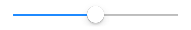
A widget representing a numeric value as an movable indicator on a horizontal line.
Import this type with “const {Slider} = require('tabris');”
| Android | iOS |
|---|---|
 |
 |
Properties
maximum
Type: number, default: 100
The maximum value.
minimum
Type: number, default: 0
The minimum value.
selection
Type: number, default: 0
The actual value.
tintColor
Type: Color
The color used to display the current selection.
Events
maximumChanged
Fired when the maximum property has changed.
Event Parameters
-
target: this The widget the event was fired on.
-
value: number The new value of maximum.
minimumChanged
Fired when the minimum property has changed.
Event Parameters
-
target: this The widget the event was fired on.
-
value: number The new value of minimum.
select
Fired when the selection property is changed by the user.
Event Parameters
-
target: this The widget the event was fired on.
-
selection: number The new value of selection.
selectionChanged
Fired when the selection property has changed.
Event Parameters
-
target: this The widget the event was fired on.
-
value: number The new value of selection.
tintColorChanged
Fired when the tintColor property has changed.
Event Parameters
Example
const {Slider, TextView, ui} = require('tabris');

// Create a slider with a selection handler

let textView = new TextView({
  left: 10, right: 10, top: '30%',
  alignment: 'center',
  font: '22px sans-serif',
  text: '50'
}).appendTo(ui.contentView);

new Slider({
  left: 50, top: [textView, 20], right: 50,
  minimum: -50,
  selection: 50,
  maximum: 150
}).on('selectionChanged', ({value}) => textView.text = value)
  .appendTo(ui.contentView);