ProgressBar
Extends Widget
A widget representing a numeric value as a horizontal bar with a growing indicator.
Import this type with “const {ProgressBar} = require('tabris');”
| Android | iOS |
|---|---|
 |
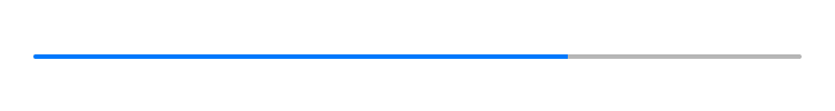 |
Properties
maximum
Type: number, default: 100
The value that represents a progress of 100%.
minimum
Type: number, default: 0
The value that represents a progress of 0%.
selection
Type: number, default: 0
The actual progress to be displayed.
state
AndroidWindows 10
Type: string, supported values: normal, paused, error, default: normal
This property affects the color of the progress indicator. Not supported on iOS.
tintColor
Type: Color
The color used to display the current progress.
Example
const {ProgressBar, ui} = require('tabris');

// A progress bar that is animated using a timer

let progressBar = new ProgressBar({
  left: 15, right: 15, centerY: 0,
  maximum: 300,
  selection: 100
}).appendTo(ui.contentView);

setInterval(() => {
  let selection = progressBar.selection + 1;
  progressBar.selection = selection > 300 ? 0 : selection;
}, 20);