ToggleButton
Extends Widget
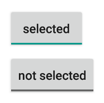
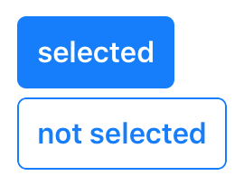
A push button that “snaps in”, i.e. it is selected when pressed and deselected when pressed again.
Import this type with “const {ToggleButton} = require('tabris');”
| Android | iOS |
|---|---|
 |
 |
Properties
alignment
Type: string, supported values: left, right, center, default: center
The horizontal alignment of the button text.
checked
Type: boolean, default: false
The checked state of the toggle button.
image
Type: Image
An image to be displayed on the button.
text
Type: string
The button’s label text.
textColor
Type: Color
The color of the text.
Events
alignmentChanged
Fired when the alignment property has changed.
Event Parameters
-
target: this The widget the event was fired on.
-
value: string The new value of alignment.
checkedChanged
Fired when the checked property changes.
Event Parameters
-
target: this The widget the event was fired on.
-
value: boolean The new value of the
checkedproperty.
imageChanged
Fired when the image property has changed.
Event Parameters
select
Fired when the toggle button is selected or deselected by the user.
Event Parameters
-
target: this The widget the event was fired on.
-
checked: boolean The current value of checked.
textChanged
Fired when the text property has changed.
Event Parameters
-
target: this The widget the event was fired on.
-
value: string The new value of text.
textColorChanged
Fired when the textColor property has changed.
Event Parameters
Example
const {ToggleButton, ui} = require('tabris');

// Create a toggle button with a checked handler

new ToggleButton({
  left: 10, top: 10,
  text: 'checked',
  checked: true
}).on('checkedChanged', event => event.target.text = event.value ? 'checked' : 'not checked')
  .appendTo(ui.contentView);

