CollectionView
Extends Widget
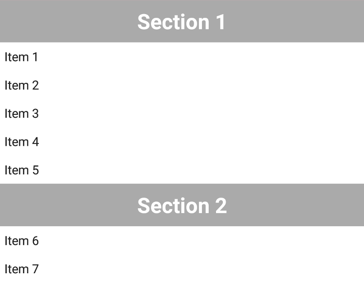
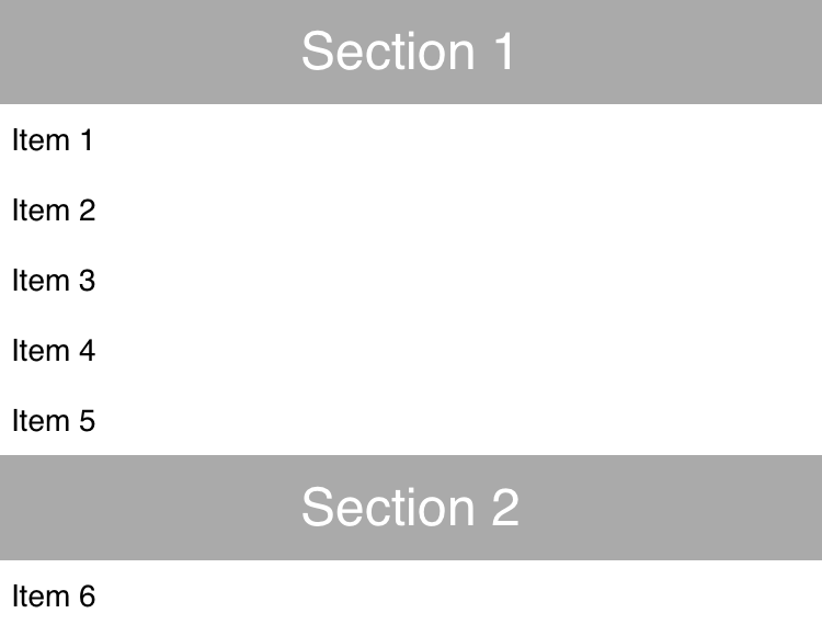
A scrollable list that displays data items in cells, one per row. Cells are created on demand by the createCell callback and reused on scrolling.
Import this type with “const {CollectionView} = require('tabris');”
| Android | iOS |
|---|---|
 |
 |
Methods
insert(index, count)
Parameters:
- index: number
- count: number [Optional]
- the position to insert the items at. A negative index is interpreted as relative to the end. If the given index is greater than the item count, new items will be appended at the end.
Inserts one or more items at the given index. When no count is specified, a single item will be added at the given index. New cells may be created if needed. The updateCell callback will only be called for those new items that become immediately visible. Note that inserting new items changes the index of all subsequent items. This operation will update the itemCount property.
load(itemCount)
Parameters:
- itemCount: number
- the number of items in the model to load.
Loads a new model with the given itemCount. This operation will update the itemCount property.
refresh(index)
Parameters:
- index: number [Optional]
- the index of the item that was changed.
Triggers an update of the item at the given index by calling the updateCell callback of the corresponding. If no index is given, all visible items will be updated.
remove(index, count)
Parameters:
- index: number
- the index of the first item to remove. A negative value is interpreted as relative to the end.
- count: number [Optional]
- the number of items to remove.
Removes one or more items beginning with the given index. When no count is given, only the item at index will be removed. Note that this changes the index of all subsequent items, however. This operation will update the itemCount property.
reveal(index)
Parameters:
- index: number
- the index of the item to reveal. If this is negative, it is interpreted as relative to the end
Scrolls the item with the given index into view.
Properties
cellHeight
Type: number|“auto”|((index: number, cellType: string) => number|“auto”), default: auto
The height of a collection cell. If set to "auto", the cell height will be calculated individually for each cell. If set to a function, this function will be called for every item, providing the item index and the cell type as parameters, and must return the cell height for the given item.
cellType
Type: string|((index: number) => string)|null
The name of the cell type to use for the item at the given index. This name will be passed to the createCell and cellHeight callbacks. Cells will be reused only for those items that map to the same cell type. If set to a function, this function will be called for every item, providing the item index as a parameter, and must return a unique name for the cell type to use for the given item.
columnCount
Type: number, default: 1
The number of columns to display in the collection view. If set to a value n > 1, each row will contain n items. The available space will be equally distributed between columns. On Windows, this feature cannot be combined with variable cell height.
createCell
Type: (cellType: string) => Widget
A callback used to create a new reusable cell widget for a given type. This callback will be called by the framework and the created cell will be reused for different items. The created widget should be populated in the updateCell function.
This property can only be set on widget creation. Once set, it cannot be changed anymore.
firstVisibleIndex
read-only
Type: number
The index of the first item that is currently visible on screen.
itemCount
Type: number
The number of items to display. To add or remove items later, use the methods insert() and remove() instead of setting the itemCount. To display a new list of items, use the load() method.
lastVisibleIndex
read-only
Type: number
The index of the last item that is currently visible on screen.
refreshEnabled
iOSAndroid
Type: boolean, default: false
Enables the user to trigger a refresh by using the pull-to-refresh gesture.
refreshIndicator
iOSAndroid
Type: boolean, default: false
Whether the refresh indicator is currently visible. Will be set to true when a refresh event is triggered. Reset it to false when the refresh is finished.
refreshMessage
iOS
Type: string, default: ""
The message text displayed together with the refresh indicator. Currently not supported on Android.
updateCell
Type: (cell: Widget, index: number) => void
A callback used to update a given cell widget to display the item with the given index. This callback will be called by the framework.
This property can only be set on widget creation. Once set, it cannot be changed anymore.
Events
cellHeightChanged
Fired when the cellHeight property has changed.
Event Parameters
-
target: this The widget the event was fired on.
-
value: number|“auto”|((index: number, cellType: string) => number|“auto”) The new value of cellHeight.
cellTypeChanged
Fired when the cellType property has changed.
Event Parameters
-
target: this The widget the event was fired on.
-
value: string|((index: number) => string)|null The new value of cellType.
columnCountChanged
Fired when the columnCount property has changed.
Event Parameters
-
target: this The widget the event was fired on.
-
value: number The new value of columnCount.
firstVisibleIndexChanged
Fired when the firstVisibleIndex property has changed.
Event Parameters
-
target: this The widget the event was fired on.
-
value: number The new value of firstVisibleIndex.
itemCountChanged
Fired when the itemCount property has changed.
Event Parameters
-
target: this The widget the event was fired on.
-
value: number The new value of itemCount.
lastVisibleIndexChanged
Fired when the lastVisibleIndex property has changed.
Event Parameters
-
target: this The widget the event was fired on.
-
value: number The new value of lastVisibleIndex.
refresh
iOSAndroid
Fired when the user requested a refresh. An event listener should reset the refreshIndicator property when refresh is finished.
refreshEnabledChanged
Fired when the refreshEnabled property has changed.
Event Parameters
-
target: this The widget the event was fired on.
-
value: boolean The new value of refreshEnabled.
refreshIndicatorChanged
Fired when the refreshIndicator property has changed.
Event Parameters
-
target: this The widget the event was fired on.
-
value: boolean The new value of refreshIndicator.
refreshMessageChanged
Fired when the refreshMessage property has changed.
Event Parameters
-
target: this The widget the event was fired on.
-
value: string The new value of refreshMessage.
scroll
Fired while the collection view is scrolling.
Event Parameters
-
target: this The widget the event was fired on.
-
deltaX: number Currently always 0.
-
deltaY: number The delta of the scroll position. Positive when scrolling up and negative when scrolling down.
select
Fired when a cell is selected.
Event Parameters
-
target: this The widget the event was fired on.
-
index: number The index of the selected item.
Example
// Create a collection view, initialize its cells and fill it with items
const {CollectionView, Composite, ImageView, TextView, ui} = require('tabris');
const IMAGE_PATH = 'resources/';

let people = [
  ['Holger', 'Staudacher', 'holger.jpg'],
  ['Ian', 'Bull', 'ian.jpg'],
  ['Jochen', 'Krause', 'jochen.jpg'],
  ['Jordi', 'Böhme López', 'jordi.jpg'],
  ['Markus', 'Knauer', 'markus.jpg'],
  ['Moritz', 'Post', 'moritz.jpg'],
  ['Ralf', 'Sternberg', 'ralf.jpg'],
  ['Tim', 'Buschtöns', 'tim.jpg']
].map(([firstName, lastName, image]) => ({firstName, lastName, image: IMAGE_PATH + image}));

new CollectionView({
  left: 0, top: 0, right: 0, bottom: 0,
  itemCount: people.length,
  cellHeight: 256,
  createCell: () => {
    let cell = new Composite();
    new ImageView({
      top: 16, centerX: 0, width: 200, height: 200
    }).appendTo(cell);
    new TextView({
      left: 30, top: 'prev() 16', right: 30,
      alignment: 'center'
    }).appendTo(cell);
    return cell;
  },
  updateCell: (cell, index) => {
    let person = people[index];
    cell.apply({
      ImageView: {image: person.image},
      TextView: {text: person.firstName}
    });
  }
}).on('select', ({index}) => console.log('selected', people[index].firstName))
  .appendTo(ui.contentView);

