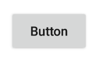
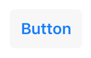
Button
Extends Widget
A push button. Can contain a text or an image.
Import this type with “const {Button} = require('tabris');”
| Android | iOS |
|---|---|
 |
 |
Properties
alignment
Type: string, supported values: left, right, center, default: center
The horizontal alignment of the button text.
image
Type: Image
An image to be displayed on the button.
text
Type: string
The button’s label text.
textColor
Type: Color
The color of the text.
Events
alignmentChanged
Fired when the alignment property has changed.
Event Parameters
-
target: this The widget the event was fired on.
-
value: string The new value of alignment.
imageChanged
Fired when the image property has changed.
Event Parameters
select
Fired when the button is pressed.
textChanged
Fired when the text property has changed.
Event Parameters
-
target: this The widget the event was fired on.
-
value: string The new value of text.
textColorChanged
Fired when the textColor property has changed.
Event Parameters
Example
const {Button, ui} = require('tabris');

// Create a push button that counts up on selection

let count = 0;

new Button({
  left: 10, top: 10,
  text: 'Button'
}).on('select', ({target}) => target.text = 'Pressed ' + (++count) + ' times')
  .appendTo(ui.contentView);

