Class “Tab”
Object > NativeObject > Widget > Composite > Tab
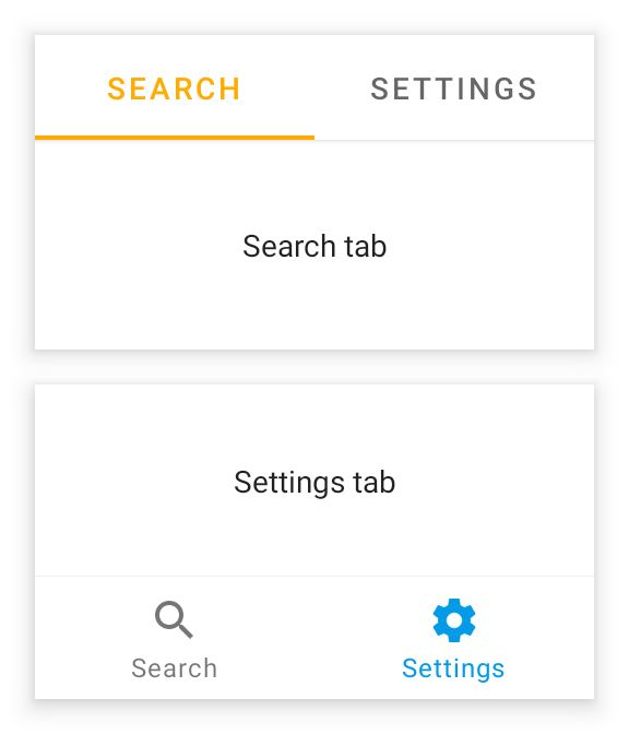
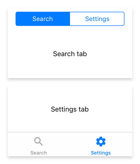
A container representing a single tab of a TabFolder widget.


| Constructor | public |
| Singleton | No |
| Namespace | tabris |
| Direct subclasses | None |
| JSX support | Element: <Tab/>Parent element: <TabFolder/>Child elements: Widgets Text content: Not supported |
Example
import {Tab, TabFolder, contentView} from 'tabris';

new TabFolder({left: 0, top: 0, right: 0, bottom: 0})
  .append(new Tab({title: 'Albums'}))
  .append(new Tab({title: 'Artists'}))
  .onSelect(({selection}) => console.log(`Tab changed to ${selection}`))
  .appendTo(contentView);
See also:
JSX Creating a Tab inside a TabFolder
Constructor
new Tab(properties?)
| Parameter | Type | Optional | Description |
|---|---|---|---|
| properties | Properties<Tab> |
Yes | Sets all key-value pairs in the properties object as widget properties. |
Methods
insertBefore(widget)
Inserts this widget directly before the given Tab.
| Parameter | Type | Optional | Description |
|---|---|---|---|
| widget | Tab |
No |
Returns this
Properties
badge
A badge to attach on the tab. The property only has an effect when the parent TabFolder has its tabBarLocation set to bottom. Setting the badge to 0 hides the badge. The background color of the badge can be controlled with the badgeColor property.
| Type | number |
| Settable | Yes |
| Change events | Yes |
badgeColor
The background color used for the badge indicator.
| Type | ColorValue |
| Settable | Yes |
| Change events | Yes |
image
An image to be displayed on the tab. Will not be shown on iOS if the TabFolder’s tabBarLocation is set to top
| Type | ImageValue |
| Settable | Yes |
| Change events | Yes |
selectedImage
An image to be displayed on the currently active tab.
| Type | ImageValue |
| Settable | Yes |
| Change events | Yes |
title
The title to be displayed on the tab.
| Type | string |
| Settable | Yes |
| Change events | Yes |
Events
appear
Fired when the tab will become visible, i.e. the selection of its TabFolder.
disappear
Fired when the tab is no longer visible, i.e. it no longer is the selection of its TabFolder.
select
Fired when the tab is tapped by the user. The event is fired either when the tab is first selected or when it is already visible and tapped.
reselect
Fired when the tab is tapped by the user while it is already visible.
Change Events
titleChanged
Fired when the title property has changed.
| Parameter | Type | Description |
|---|---|---|
| value | string |
The new value of title. |
imageChanged
Fired when the image property has changed.
| Parameter | Type | Description |
|---|---|---|
| value | ImageValue |
The new value of image. |
selectedImageChanged
Fired when the selectedImage property has changed.
| Parameter | Type | Description |
|---|---|---|
| value | ImageValue |
The new value of selectedImage. |
badgeChanged
Fired when the badge property has changed.
| Parameter | Type | Description |
|---|---|---|
| value | number |
The new value of badge. |
badgeColorChanged
Fired when the badgeColor property has changed.
| Parameter | Type | Description |
|---|---|---|
| value | ColorValue |
The new value of badgeColor. |

