Object “drawer”
Object > NativeObject > Widget > Composite > ContentView > Drawer
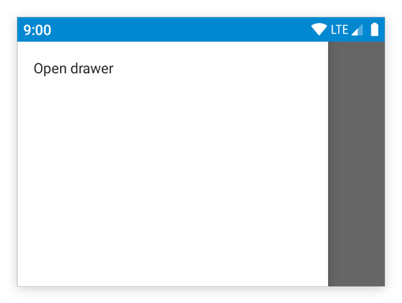
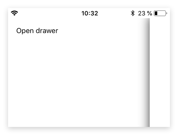
A drawer that can be swiped in from the left edge of the screen. There’s only a single instance that can be accessed via tabris.drawer. The drawer is locked by default. To use it in an application, set the property enabled to true. The drawer can contain any kind of widgets.


| Type: | Drawer extends ContentView |
| Constructor: | private |
| Singleton: | drawer |
| Namespace: | tabris |
| Direct subclasses: | None |
| JSX Support: | No |
Examples
JavaScript
import {TextView, drawer} from 'tabris';

drawer
  .set({enabled: true})
  .append(new TextView({text: 'Drawer content'}));
See also:
JSX Simple example of using a Drawer
TSX Using a Drawer for app navigation
Methods
close()
Closes the drawer.
Returns: this
open()
Opens the drawer. It may be useful to call this method on first startup, so that users notice the drawer and its contents.
Returns: this
Properties
enabled
Controls whether the drawer can be opened and closed. When set to false, the drawer cannot be opened and calls to drawer.open() will be ignored.
| Type: | boolean |
| Default: | false |
| Settable: | Yes |
| Change Event: | enabledChanged |
Events
open
Fired when the drawer is opened and has reached its resting position.
EventObject Type: EventObject<Drawer>
This event has no additional parameter.
close
Fired when the drawer is closed and has reached its resting position.
EventObject Type: EventObject<Drawer>
This event has no additional parameter.
Change Events
enabledChanged
Fired when the enabled property has changed.
EventObject Type: PropertyChangedEvent<Drawer, boolean>
| Property | Type | Description |
|---|---|---|
| value | boolean |
The new value of enabled. |

