Class “AlertDialog”
Object > NativeObject > Popup > AlertDialog
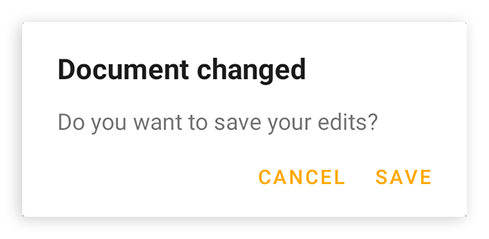
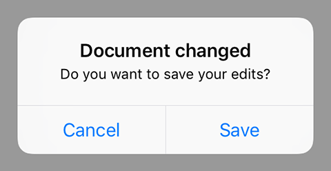
An AlertDialog represents a native dialog pop-up showing a message and up to three buttons. Is automatically disposed when closed.


| Type: | AlertDialog extends Popup |
| Constructor: | public |
| Singleton: | No |
| Namespace: | tabris |
| Direct subclasses: | None |
| JSX Support: | Element: <AlertDialog/>Parent Elements: Not supported Child Elements: Not Supported Element content sets: message |
Examples
JavaScript
import {AlertDialog} from 'tabris';

new AlertDialog({
  title: 'Document saved',
  buttons: {ok: 'OK'}
}).open();
See also:
JSX Creating various types of alert dialogs [► Run in Playground]
Constructor
new AlertDialog(properties?)
| Parameter | Type | Description |
|---|---|---|
| properties | Properties<AlertDialog> |
Sets all key-value pairs in the properties object as widget properties. Optional. |
Static Methods
open(alertDialog)
Makes the given alert dialog visible. Meant to be used with inline-JSX. In TypeScript it also casts the given JSX element from any to an actual AlertDialog.
| Parameter | Type | Description |
|---|---|---|
| alertDialog | AlertDialog |
The alert dialog to open |
Returns: AlertDialog
open(message)
Creates and opens an alert dialog with one ‘OK’ button and the given message.
| Parameter | Type | Description |
|---|---|---|
| message | string |
The message to display |
Returns: AlertDialog
Properties
buttons
An object with the texts of the buttons to display. There are up to three buttons: ok, cancel and neutral. If no text is given for a button it will not be displayed. Example: {ok: 'Yes', cancel: 'No'} shows ‘Yes’ and ‘No’, but no ‘neutral’ button.
| Type: | { |
| Settable: | Yes |
| Change Event: | buttonsChanged |
message
The message to display inside the dialog.
| Type: | string |
| Settable: | Yes |
| Change Event: | messageChanged |
| JSX Content Type: | Text |
When using AlertDialog as an JSX element the elements Text content is mapped to this property.
textInputs
A composite that may contain TextInput widgets to be displayed alongside the title and message. The text values inserted by the user can be read in the dialogs close event via its texts property. Eg.: dialog.on('close', (e) => e.texts[0])
In an AlertDialog JSX element the TextInput widgets may be given as child elements.
| Type: | ContentView<TextInput> |
| Settable: | No |
| Change Event: | Not supported |
This property can only be set via constructor or JSX. Once set, it cannot change anymore.
title
The title of the dialog.
| Type: | string |
| Settable: | Yes |
| Change Event: | titleChanged |
Events
close
Fired when the dialog was closed for any reason.
EventObject Type: AlertDialogCloseEvent<AlertDialog>
| Property | Type | Description |
|---|---|---|
| button | 'ok' |
The type of button that was used to close the dialog. Can also be null, e.g. when the global back button was pressed. |
| texts | string[] |
An array containing the corresponding text values of all textInputs elements. |
closeOk
Fired when the dialog was closed by pressing the ‘ok’ button.
EventObject Type: EventObject<AlertDialog>
This event has no additional parameter.
closeCancel
Fired when the dialog was closed by pressing the ‘cancel’ button.
EventObject Type: EventObject<AlertDialog>
This event has no additional parameter.
closeNeutral
Fired when the dialog was closed by pressing the ‘neutral’ button.
EventObject Type: EventObject<AlertDialog>
This event has no additional parameter.
Change Events
titleChanged
Fired when the title property has changed.
EventObject Type: PropertyChangedEvent<AlertDialog, string>
| Property | Type | Description |
|---|---|---|
| value | string |
The new value of title. |
messageChanged
Fired when the message property has changed.
EventObject Type: PropertyChangedEvent<AlertDialog, string>
| Property | Type | Description |
|---|---|---|
| value | string |
The new value of message. |
buttonsChanged
Fired when the buttons property has changed.
EventObject Type: PropertyChangedEvent<AlertDialog, Object>
| Property | Type | Description |
|---|---|---|
| value | { |
The new value of buttons. |

