Class “TabFolder”
Object > NativeObject > Widget > Composite > TabFolder
A widget that can switch between tabs. Only children of type Tab are supported. Since the TabFolder does not compute its own size, the width and height must be defined by the respective layout properties (e.g. either width or left and right must be specified).
| Type: | TabFolder<TabType> extends Composite<TabType> |
| Generics: | TabType: The common widget class of the children this TabFolder can contain. Must be a subclass of Tab and defaults to Tab. |
| Constructor: | public |
| Singleton: | No |
| Namespace: | tabris |
| Direct subclasses: | None |
| JSX Support: | Element: <TabFolder/>Parent Elements: <Canvas/>, <Cell/>, <Composite/>, <Page/>, <RefreshComposite/>, <Row/>, <ScrollView/>, <Stack/>, <Tab/>Child Elements: <Tab/> |
Examples
JavaScript
import {Tab, TabFolder, contentView} from 'tabris';

new TabFolder({left: 0, top: 0, right: 0, bottom: 0})
  .append(new Tab({title: 'Albums'}))
  .append(new Tab({title: 'Artists'}))
  .onSelect(({selection}) => console.log(`Tab changed to ${selection}`))
  .appendTo(contentView);
See also:
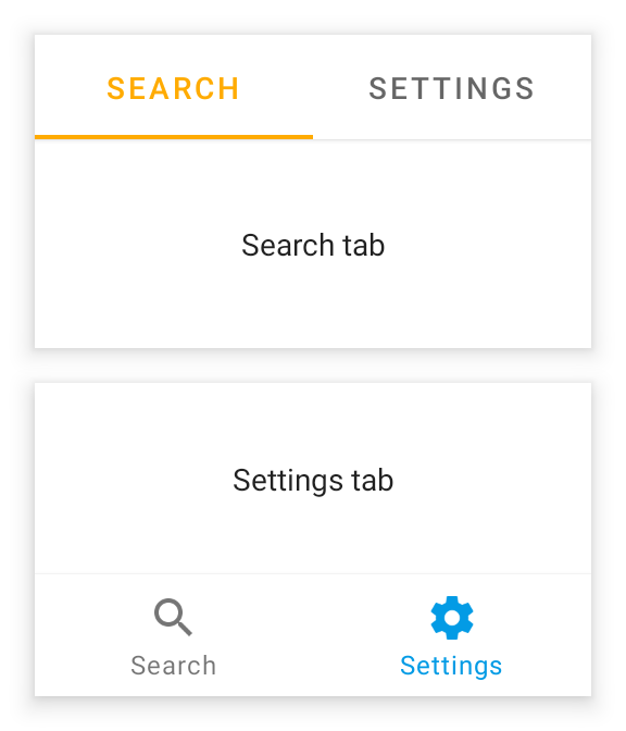
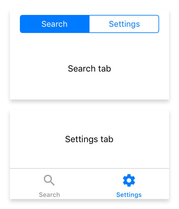
JSX Creating a TabFolder containing a set of tabs [► Run in Playground]
JS tabfolder-swipe-parallax.js [► Run in Playground]
JSX tabfolder-swipe.jsx [► Run in Playground]
Constructor
new TabFolder(properties?)
| Parameter | Type | Description |
|---|---|---|
| properties | Properties<TabFolder> |
Sets all key-value pairs in the properties object as widget properties. Optional. |
Properties
paging
Enables swiping through tabs.
| Type: | boolean |
| Settable: | Yes |
| Change Event: | pagingChanged |
selectedTabIndicatorTintColor
The color used for the indicator of the selected tab. Only applies when the tabBarLocation is top. Available on Android and iOS 13+.
| Type: | ColorValue |
| Settable: | Yes |
| Change Event: | selectedTabIndicatorTintColorChanged |
selectedTabTintColor
The color used for the text and icon of a selected tab.
| Type: | ColorValue |
| Settable: | Yes |
| Change Event: | selectedTabTintColorChanged |
selection
The currently selected tab.
| Type: | TabType |
| Settable: | Yes |
| Change Event: | selectionChanged |
selectionIndex
The index of the currently selected tab.
| Type: | number |
| Settable: | Yes |
| Change Event: | selectionIndexChanged |
tabBarBackground
The color used for the background of the bar containing the tabs.
| Type: | ColorValue |
| Settable: | Yes |
| Change Event: | tabBarBackgroundChanged |
tabBarElevation
Android
The elevation of the tab bar. Depending on the tabBarLocation different defaults are applied.
| Type: | number |
| Settable: | Yes |
| Change Event: | tabBarElevationChanged |
tabBarLocation
The placement of the tab titles. When set to "hidden", the tab bar will not be visible. When set to "auto", the position is platform dependent.
| Type: | 'top' | 'bottom' | 'hidden' | 'auto' |
| Default: | 'auto' |
| Settable: | By Constructor or JSX |
| Change Event: | Not supported |
This property can only be set via constructor or JSX. Once set, it cannot change anymore.
tabMode
Android
Controls how the tabs make use of the available horizontal space. Setting the tabMode to "fixed" makes the tabs span the entire available space. In case of a very wide TabFolder the "fixed" mode centers the tabs. The mode "scrollable" left aligns the tabs and allows to scroll the tabs if there are more tabs than would fit in the available space. Available on Android only.
| Type: | 'fixed' | 'scrollable' |
| Default: | 'fixed' |
| Settable: | By Constructor or JSX |
| Change Event: | Not supported |
This property can only be set via constructor or JSX. Once set, it cannot change anymore.
tabTintColor
The color used for the text and icon of a tab.
When the tabBarLocation is top on iOS, this property affects the entire appearance of the bar. No other color properties have an effect in that configuration.
| Type: | ColorValue |
| Settable: | Yes |
| Change Event: | tabTintColorChanged |
Events
select
Fired when the user taps on a tab. The event also fires when the same tab is tapped multiple times.
EventObject Type: TabFolderSelectEvent<TabFolder>
| Property | Type | Description |
|---|---|---|
| selection | Tab |
The Tap selected by the user. |
scroll
Fired when paging is enabled and a tab is scrolled. The event parameter contains position information relative to the currently selected Tab. Eg.: scrolling a 500px wide tab 10% to the left sets offset to 50. Scrolling 10% to the right sets offset to -50.
EventObject Type: TabFolderScrollEvent<TabFolder>
| Property | Type | Description |
|---|---|---|
| offset | number |
Number of pixels the current tab has scrolled horizontally. |
| selection | Tab |
The current value of the selection property. |
Change Events
pagingChanged
Fired when the paging property has changed.
EventObject Type: PropertyChangedEvent<TabFolder, boolean>
| Property | Type | Description |
|---|---|---|
| value | boolean |
The new value of paging. |
selectionChanged
Fired when the selection property has changed.
EventObject Type: PropertyChangedEvent<TabFolder, TabType>
| Property | Type | Description |
|---|---|---|
| value | TabType |
The new value of selection. |
selectionIndexChanged
Fired when the selectionIndex property has changed.
EventObject Type: PropertyChangedEvent<TabFolder, number>
| Property | Type | Description |
|---|---|---|
| value | number |
The new value of selectionIndex. |
tabTintColorChanged
Fired when the tabTintColor property has changed.
EventObject Type: PropertyChangedEvent<TabFolder, ColorValue>
| Property | Type | Description |
|---|---|---|
| value | ColorValue |
The new value of tabTintColor. |
selectedTabTintColorChanged
Fired when the selectedTabTintColor property has changed.
EventObject Type: PropertyChangedEvent<TabFolder, ColorValue>
| Property | Type | Description |
|---|---|---|
| value | ColorValue |
The new value of selectedTabTintColor. |
tabBarBackgroundChanged
Fired when the tabBarBackground property has changed.
EventObject Type: PropertyChangedEvent<TabFolder, ColorValue>
| Property | Type | Description |
|---|---|---|
| value | ColorValue |
The new value of tabBarBackground. |
selectedTabIndicatorTintColorChanged
Fired when the selectedTabIndicatorTintColor property has changed.
EventObject Type: PropertyChangedEvent<TabFolder, ColorValue>
| Property | Type | Description |
|---|---|---|
| value | ColorValue |
The new value of selectedTabIndicatorTintColor. |
tabBarElevationChanged
Fired when the tabBarElevation property has changed.
EventObject Type: PropertyChangedEvent<TabFolder, number>
| Property | Type | Description |
|---|---|---|
| value | number |
The new value of tabBarElevation. |