Class “RadioButton”
Object > NativeObject > Widget > RadioButton
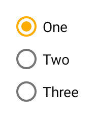
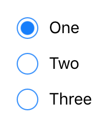
A radio button. Selecting a radio button de-selects all its siblings (i.e. all radio buttons within the same parent).
| Type: | RadioButton extends Widget |
| Constructor: | public |
| Singleton: | No |
| Namespace: | tabris |
| Direct subclasses: | None |
| JSX Support: | Element: <RadioButton/>Parent Elements: <Canvas/>, <Cell/>, <Composite/>, <Page/>, <RefreshComposite/>, <Row/>, <ScrollView/>, <Stack/>, <Tab/>Child Elements: Not Supported Element content sets: text |
Examples
JavaScript
import {RadioButton, contentView} from 'tabris';

new RadioButton({text: 'One', checked: true})
  .onSelect(event => console.log(`Checked: ${event.checked}`))
  .appendTo(contentView);

new RadioButton({text: 'Two'})
  .onSelect(event => console.log(`Checked: ${event.checked}`))
  .appendTo(contentView);
See also:
JSX Creating a set of RadioButtons [► Run in Playground]
Constructor
new RadioButton(properties?)
| Parameter | Type | Description |
|---|---|---|
| properties | Properties<RadioButton> |
Sets all key-value pairs in the properties object as widget properties. Optional. |
Properties
checked
The checked state of the radio button.
| Type: | boolean |
| Default: | false |
| Settable: | Yes |
| Change Event: | checkedChanged |
checkedTintColor
The color of the selectable area in checked state. Will fall back to tintColor if not set.
| Type: | ColorValue |
| Settable: | Yes |
| Change Event: | checkedTintColorChanged |
font
The font used for the text.
| Type: | FontValue |
| Settable: | Yes |
| Change Event: | fontChanged |
text
The label text of the radio button.
| Type: | string |
| Settable: | Yes |
| Change Event: | textChanged |
| JSX Content Type: | Text |
When using RadioButton as an JSX element the elements Text content is mapped to this property.
textColor
The color of the text.
| Type: | ColorValue |
| Settable: | Yes |
| Change Event: | textColorChanged |
tintColor
The color of the selectable area.
| Type: | ColorValue |
| Settable: | Yes |
| Change Event: | tintColorChanged |
Events
select
Fired when the radio button is selected or deselected by the user.
EventObject Type: RadioButtonSelectEvent<RadioButton>
| Property | Type | Description |
|---|---|---|
| checked | boolean |
The new value of checked. |
Change Events
checkedChanged
Fired when the checked property has changed.
EventObject Type: PropertyChangedEvent<RadioButton, boolean>
| Property | Type | Description |
|---|---|---|
| value | boolean |
The new value of checked. |
textChanged
Fired when the text property has changed.
EventObject Type: PropertyChangedEvent<RadioButton, string>
| Property | Type | Description |
|---|---|---|
| value | string |
The new value of text. |
textColorChanged
Fired when the textColor property has changed.
EventObject Type: PropertyChangedEvent<RadioButton, ColorValue>
| Property | Type | Description |
|---|---|---|
| value | ColorValue |
The new value of textColor. |
tintColorChanged
Fired when the tintColor property has changed.
EventObject Type: PropertyChangedEvent<RadioButton, ColorValue>
| Property | Type | Description |
|---|---|---|
| value | ColorValue |
The new value of tintColor. |
checkedTintColorChanged
Fired when the checkedTintColor property has changed.
EventObject Type: PropertyChangedEvent<RadioButton, ColorValue>
| Property | Type | Description |
|---|---|---|
| value | ColorValue |
The new value of checkedTintColor. |
fontChanged
Fired when the font property has changed.
EventObject Type: PropertyChangedEvent<RadioButton, FontValue>
| Property | Type | Description |
|---|---|---|
| value | FontValue |
The new value of font. |