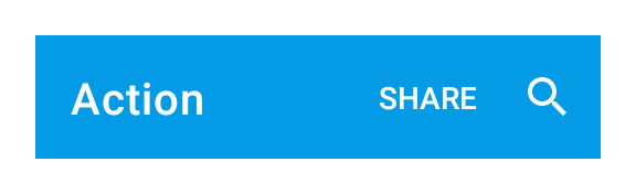
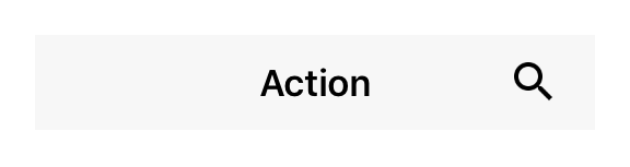
Class “Action”
Object > NativeObject > Widget > Action
An executable item that is integrated in the application’s navigation menu. Add a select listener to react to action taps.
| Type: | Action extends Widget |
| Constructor: | public |
| Singleton: | No |
| Namespace: | tabris |
| Direct subclasses: | SearchAction |
| JSX Support: | Element: <Action/>Parent Elements: <NavigationView/>Child Elements: Not Supported Element content sets: title |
Examples
JavaScript
import {Action, NavigationView, contentView} from 'tabris';

const navigationView = new NavigationView({layoutData: 'stretch'})
  .appendTo(contentView);

new Action({
  title: 'Settings',
  image: 'resources/settings.png'
}).onSelect(() => console.log('Settings selected'))
  .appendTo(navigationView);
See also:
JSX Creating a simple Action
JSX Using placement property
Constructor
new Action(properties?)
| Parameter | Type | Description |
|---|---|---|
| properties | Properties<Action> |
Sets all key-value pairs in the properties object as widget properties. Optional. |
Properties
image
Icon image for the action.
On iOS the image is tinted with the apps default accent color whereas on Android the image is shown as is. When an action is placed into a NavigationView, the NavigationView property actionColor can be used to adjust the action tint color.
| Type: | ImageValue |
| Settable: | Yes |
| Change Event: | imageChanged |
placement
Actions with ‘default’ placement will be visible in the toolbar if enough space is available, otherwise moved to the overflow section. Setting the property to ‘overflow’ makes the action appear there exclusively. Lastly, ‘navigation’ puts the action in the position normally occupied by the drawer/back button. When ‘navigation’ is used, only the Action image will be shown. If multiple actions have this value only the first one is displayed.
| Type: | 'default' | 'overflow' | 'navigation' |
| Default: | 'default' |
| Settable: | Yes |
| Change Event: | placementChanged |
title
The text to be displayed for the action.
When an action is placed into a NavigationView, the NavigationView property actionTextColor can be used to adjust the action title color on Android.
| Type: | string |
| Settable: | Yes |
| Change Event: | titleChanged |
| JSX Content Type: | Text |
When using Action as an JSX element the elements Text content is mapped to this property.
Events
select
Fired when the action is invoked.
EventObject Type: EventObject<Action>
This event has no additional parameter.
Change Events
imageChanged
Fired when the image property has changed.
EventObject Type: PropertyChangedEvent<Action, ImageValue>
| Property | Type | Description |
|---|---|---|
| value | ImageValue |
The new value of image. |
placementChanged
Fired when the placement property has changed.
EventObject Type: PropertyChangedEvent<Action, string>
| Property | Type | Description |
|---|---|---|
| value | string |
The new value of placement. |
titleChanged
Fired when the title property has changed.
EventObject Type: PropertyChangedEvent<Action, string>
| Property | Type | Description |
|---|---|---|
| value | string |
The new value of title. |