UI Architecture
The UI of a Tabris.js app consists of platform-native elements that can be controlled by a cross-platform JavaScript API. Within the framework these elements are implemented in native code and provide a user experience that feels familiar on each OS.
Type Hierarchy
In Tabris.js all objects that represent visual elements inherit from the NativeObject class which provides very basic event and property handling functionality.
Important subclasses include:
tabris.NativeObject
 |- tabris.Tabris
 |- tabris.Widget
 |  |- tabris.Button
 |  |- tabris.Composite
 |  |  |- tabris.ContentView
 |  |     |- tabris.Drawer
 |  | - ... etc ...
 |- tabris.Popup
 |  |- tabris.AlertDialog
 |  |- tabris.Popover
 |  |- ... etc ...
 |- tabris.StatusBar
 |- tabris.NavigationBar
 | ... etc ...
These classes may be accessed directly via the global tabris object…
new tabris.AlertDialog();
…or explicitly imported:
import {AlertDialog} from 'tabris';
new AlertDialog();
const {AlertDialog} = require('tabris');
new AlertDialog();
Object Hierarchy
The top-level parent for the application UI is represented by the global object tabris, which then holds various singleton instances representing different aspects of the UI:
tabris
|- tabris.contentView
|- tabris.drawer
|- tabris.statusBar
|- tabris.navigationBar
Like with classes these instances may be accessed directly via the global tabris object…
tabris.contentView.append(widget);
…or explicitly imported:
import {contentView} from 'tabris';
contentView.append(widget);
const {contentView} = require('tabris');
contentView.append(widget);
Widgets
Widgets can (with some exceptions) be freely created, arranged and composed to form the main UI of your application. Every widget has needs parent to be visible (with the exception of ContentView, see below), but only widgets of the type tabris.Composite (or any of its subclasses) can have children. All widget types are (direct or indirect) subclasses of tabris.Widget and can be created by calling their constructor (if public), or using JSX elements.
See also “Widget Basics”.
ContentView
tabris.ContentView is a subclass of tabris.Composite and the only widget that is visible without a parent. It can not be instantiated or disposed directly. Instead, any instance is bound to another tabris.NativeObject instance:
| ContentView instance | Description |
|---|---|
tabris.contentView |
Represents the main UI. Created by the framework on application start and bound to the global tabris object. Can never be disposed. |
tabris.drawer |
Represents the drawer (see below). Created by the framework on application start and bound to the global tabris object. Can never be disposed. |
popover.contentView |
Created with and bound to Popover instances. Disposed when the popover closes. |
alertDialog.textInputs |
Created with and bound to AlertDialog instances. Disposed when the dialog closes. Only accepts instances of TextInput as children. |
Newly created widgets can be added directly to a ContentView instance to make them visible immediately:
JSX:
tabris.contentView.append(
  <SomeWidget />
);
JS:
tabris.contentView.append(
  new SomeWidget()
);

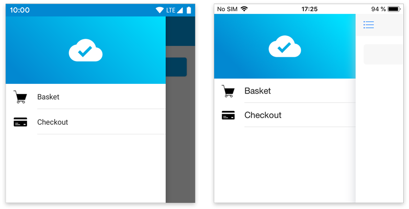
Drawer
tabris.drawer is a singleton instance of tabris.Drawer, extending tabris.ContentView. It’s a widget container that can be slid in from the left edge of the screen, typically used for top-level navigation.
In Tabris.js, this drawer is disabled by default. To use it in an application, you have to enable it:
tabris.drawer.enabled = true;

The drawer can be opened by a swipe from the left edge of the screen or by tapping the action on the left side of a NavigationView ( “hamburger button” or “drawer action”). To open and close the drawer programmatically, you can use its open() and close() methods, respectively.
Just like tabris.contentView a drawer may contain any kind of widgets:
tabris.drawer.append(
  <SomeWidget />
);
Popups
Popups are floating on top of your main UI and are specialized for specific use cases. All popup types are direct subclasses of tabris.Popup and can be created by calling their constructor (if public), or using JSX elements.
Unlike widgets they do not need a parent to be visible. Instead they are made visible by calling open() on the instance or the static open method provided directly on the class, e.g. AlertDialog.open(...). The latter is meant to be used with inline-JSX, e.g.:
const dialog = AlertDialog.open(
  <AlertDialog>
    Hello World!
  </AlertDialog>
);
Two popup types can also host widgets: Popover via popover.contentView and AlertDialog via alertDialog.texts, though the latter only accepts TextInput widgets.
StatusBar
tabris.statusBar is a singleton instance of tabris.StatusBar, extending tabris.NativeObject. It represents the small area - usually on the top of the screen - that displays notifications, status icons and time. The object can be used to control different aspects of the element’s look and feel, such as background color and visibility.

NavigationBar
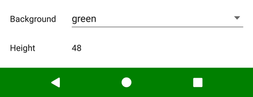
tabris.navigationBar is a singleton instance of tabris.NavigationBar, extending tabris.NativeObject. It represents the area that contains the Back, Home, etc. buttons on Android. The object can be used to control that element’s background color and visibility.


