Class “Button”
Object > NativeObject > Widget > Button
A push button. Can contain a text or an image.
| Type: | Button extends Widget |
| Constructor: | public |
| Singleton: | No |
| Namespace: | tabris |
| Direct subclasses: | None |
| JSX Support: | Element: <Button/>Parent Elements: <Canvas/>, <Cell/>, <Composite/>, <Page/>, <RefreshComposite/>, <Row/>, <ScrollView/>, <Stack/>, <Tab/>Child Elements: Not Supported Element content sets: text |
Examples
JavaScript
import {Button, contentView} from 'tabris';

new Button({text: 'Save'})
  .onSelect(() => console.log('Button tapped'))
  .appendTo(contentView);
See also:
JSX Create a simple Button
JSX Create buttons with different styles
Constructor
new Button(properties?)
| Parameter | Type | Description |
|---|---|---|
| properties | Properties<Button> |
Sets all key-value pairs in the properties object as widget properties. Optional. |
Properties
alignment
The horizontal alignment of the button text.
| Type: | 'left' | 'right' | 'centerX' |
| Default: | 'centerX' |
| Settable: | Yes |
| Change Event: | alignmentChanged |
autoCapitalize
Control how the button text is capitalized.
'default'- The platform decides on the capitalization'none'- The text is displayed unaltered'all'- Every letter is capitalized
| Type: | 'default' |
| Default: | 'default' |
| Settable: | Yes |
| Change Event: | autoCapitalizeChanged |
font
The font used for the button text.
| Type: | FontValue |
| Settable: | Yes |
| Change Event: | fontChanged |
image
An image to be displayed on the button.
| Type: | ImageValue |
| Settable: | Yes |
| Change Event: | imageChanged |
imageTintColor
A color to change the image appearance. All opaque parts of the image will be tinted with the given color. Set to initial to remove the effect.
| Type: | ColorValue |
| Settable: | Yes |
| Change Event: | imageTintColorChanged |
strokeColor
Controls the line width of a button with the style outline.
| Type: | ColorValue |
| Settable: | Yes |
| Change Event: | strokeColorChanged |
strokeWidth
Controls the line color of a button with the style outline. Uses a platform-specific default if set to null.
| Type: | number | null |
| Default: | null |
| Settable: | Yes |
| Change Event: | strokeWidthChanged |
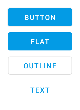
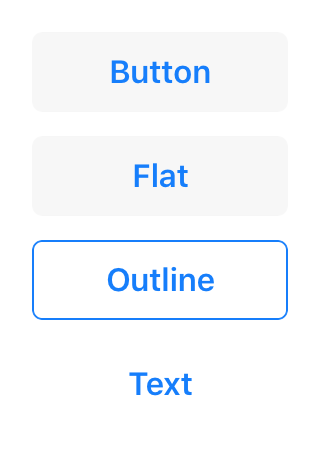
style
The style controls the appearance of a Button and has to be provided in its constructor. The default style creates a platform specific button, which is flat on iOS and has an elevation and shadow on Android. In addition the following specific style values can be used:
elevateA button with a platform specific background color, elevation and a surrounding drop shadow. Only supported on AndroidflatA button with no elevation and a platform specific background coloroutlineA button with a transparent background and an outline stroke which can be controlled via the propertiesstrokeWidthandstrokeColortextA button with no background and only consisting of its text label.
| Type: | 'default' | 'elevate' | 'flat' | 'outline' | 'text' |
| Default: | 'default' |
| Settable: | By Constructor or JSX |
| Change Event: | Not supported |
This property can only be set via constructor or JSX. Once set, it cannot change anymore.
See also:
text
The button’s label text.
| Type: | string |
| Settable: | Yes |
| Change Event: | textChanged |
| JSX Content Type: | Text |
When using Button as an JSX element the elements Text content is mapped to this property.
textColor
The color of the text.
| Type: | ColorValue |
| Settable: | Yes |
| Change Event: | textColorChanged |
Events
select
Fired when the button is pressed.
EventObject Type: EventObject<Button>
This event has no additional parameter.
Change Events
strokeColorChanged
Fired when the strokeColor property has changed.
EventObject Type: PropertyChangedEvent<Button, ColorValue>
| Property | Type | Description |
|---|---|---|
| value | ColorValue |
The new value of strokeColor. |
strokeWidthChanged
Fired when the strokeWidth property has changed.
EventObject Type: PropertyChangedEvent<Button, number | null>
| Property | Type | Description |
|---|---|---|
| value | number | null |
The new value of strokeWidth. |
alignmentChanged
Fired when the alignment property has changed.
EventObject Type: PropertyChangedEvent<Button, string>
| Property | Type | Description |
|---|---|---|
| value | string |
The new value of alignment. |
fontChanged
Fired when the font property has changed.
EventObject Type: PropertyChangedEvent<Button, FontValue>
| Property | Type | Description |
|---|---|---|
| value | FontValue |
The new value of font. |
imageChanged
Fired when the image property has changed.
EventObject Type: PropertyChangedEvent<Button, ImageValue>
| Property | Type | Description |
|---|---|---|
| value | ImageValue |
The new value of image. |
imageTintColorChanged
Fired when the imageTintColor property has changed.
EventObject Type: PropertyChangedEvent<Button, ColorValue>
| Property | Type | Description |
|---|---|---|
| value | ColorValue |
The new value of imageTintColor. |
textChanged
Fired when the text property has changed.
EventObject Type: PropertyChangedEvent<Button, string>
| Property | Type | Description |
|---|---|---|
| value | string |
The new value of text. |
textColorChanged
Fired when the textColor property has changed.
EventObject Type: PropertyChangedEvent<Button, ColorValue>
| Property | Type | Description |
|---|---|---|
| value | ColorValue |
The new value of textColor. |
autoCapitalizeChanged
Fired when the autoCapitalize property has changed.
EventObject Type: PropertyChangedEvent<Button, 'default'
| 'none'
| 'all'>
| Property | Type | Description |
|---|---|---|
| value | 'default' |
The new value of autoCapitalize. |