Object “statusBar”
Object > NativeObject > StatusBar
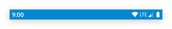
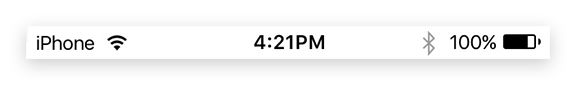
The status bar is the area where notifications, status icons and device time are displayed. The singleton instance can be accessed via statusBar.
| Type: | StatusBar extends NativeObject |
| Constructor: | private |
| Singleton: | statusBar |
| Namespace: | tabris |
| Direct subclasses: | None |
| JSX Support: | No |
Examples
JavaScript
import {statusBar} from 'tabris';

statusBar.background = 'red';
statusBar.displayMode = 'float';
See also:
JS Demonstrating various StatusBar properties
Properties
background
Background color of the status bar. Should be used in conjunction with the theme property to keep the status bar icons legible.
| Type: | ColorValue |
| Settable: | Yes |
| Change Event: | backgroundChanged |
displayMode
Controls how the status bar is positioned relative to the contentView. The value default places the content below the status bar. The hide option lets the status bar disappear, making more room for the content. The float option lets the content flow underneath the status bar.
| Type: | 'default' | 'hide' | 'float' |
| Default: | 'default' |
| Settable: | Yes |
| Change Event: | displayModeChanged |
height
The height of the status bar in device independent pixel. Can be used in conjunction with the displayMode 'float' to offset the content as to not have it covered by the status bar.
| Type: | number |
| Settable: | No |
| Change Event: | Not supported |
theme
Defines the shade used on the status bar. A dark theme sets the foreground icons to be of a light color, whereas light sets the icons to a dark color. The theme should be set in conjunction with the background property for contrast. The value default selects the default theme that depends on the device and on the app. Available on iOS and Android 6+.
| Type: | 'default' | 'light' | 'dark' |
| Default: | 'default' |
| Settable: | Yes |
| Change Event: | themeChanged |
Events
tap
iOS
Fired when status bar is tapped.
EventObject Type: StatusBarTapEvent<StatusBar>
| Property | Type | Description |
|---|---|---|
| touches | {x: number, y: number}[] |
Touch coordinates relative to the origin coordinates of the widget. |
Change Events
themeChanged
Fired when the theme property has changed.
EventObject Type: PropertyChangedEvent<StatusBar, string>
| Property | Type | Description |
|---|---|---|
| value | string |
The new value of theme. |
displayModeChanged
Fired when the displayMode property has changed.
EventObject Type: PropertyChangedEvent<StatusBar, string>
| Property | Type | Description |
|---|---|---|
| value | string |
The new value of displayMode. |
backgroundChanged
Fired when the background property has changed.
EventObject Type: PropertyChangedEvent<StatusBar, ColorValue>
| Property | Type | Description |
|---|---|---|
| value | ColorValue |
The new value of background. |