Class “ActionSheet”
Object > NativeObject > Popup > ActionSheet
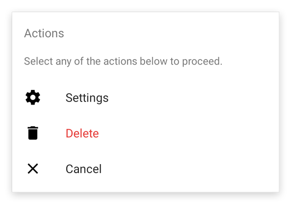
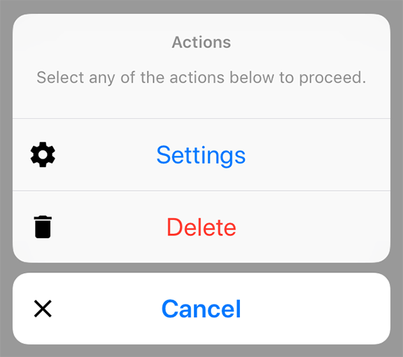
A pop up dialog that offers a selection. Is automatically disposed when closed.
| Constructor | public |
| Singleton | No |
| Namespace | tabris |
| Direct subclasses | None |
| JSX support | Element: <ActionSheet/>Child elements: <ActionSheetItem/>Text content: Sets message property |
Example
import {ActionSheet} from 'tabris';

new ActionSheet({
  title: 'ActionSheet',
  actions: [{title: 'Save'}, {title: 'Delete', style: 'destructive'}]
}).onSelect(({index}) => console.log(`Selected ${index}`))
  .open();
See also:
JSX Creating a simple ActionSheet
Constructor
new ActionSheet(properties?)
| Parameter | Type | Optional | Description |
|---|---|---|---|
| properties | Properties<ActionSheet> |
Yes | Sets all key-value pairs in the properties object as widget properties. |
Static Methods
open(actionSheet)
Makes the given action sheet visible. Meant to be used with inline-JSX. In TypeScript it also casts the given JSX element from any to an actual ActionSheet.
| Parameter | Type | Optional | Description |
|---|---|---|---|
| actionSheet | ActionSheet |
No | The action sheet to open |
Returns ActionSheet
Properties
actions
An array of objects describing the actions to be displayed. Each action must have a title and it can also have an image. Actions with the style cancel or destructive are displayed in a special way.
Note: On iPad, an action with style cancel will not be shown in the ActionSheet as per Apple’s design approach. If such button is added tapping outside of ActionSheet is equivalent to pressing the cancel action on iPad. In case of tapping outside an appropriate event will be sent by the native side as if such button was pressed.
| Type | {title: string, image?: ImageValue, style?: 'default' | 'cancel' | 'destructive'}[] |
| Settable | Yes |
| Change events | Yes |
| JSX content type | ActionSheetItem |
When using ActionSheet as an JSX element its child elements are mapped to this property. Therefore
<ActionSheet>{actions}</ActionSheet>
has the same effect as:
<ActionSheet actions={actions} />
The ActionSheetItem element needs to be imported from the tabris module separately and has the same attributes as the property type.
message
A descriptive message for the available actions.
| Type | string |
| Settable | Yes |
| Change events | Yes |
| JSX content type | string |
When using ActionSheet as an JSX element the element content is mapped to this property. Therefore
<ActionSheet>Hello World</ActionSheet>
has the same effect as:
<ActionSheet message='Hello World' />
title
The title of the action sheet.
| Type | string |
| Settable | Yes |
| Change events | Yes |
Events
close
Fired when the action sheet was closed.
| Parameter | Type | Description |
|---|---|---|
| action | {title: string, image: ImageValue, style: 'default' | 'cancel' | 'destructive'} | null |
A copy of the selected action as an instance of ActionSheetItem. If no action was selected the value is null. |
| index | number | null |
The index of the selected action. If no action was selected the value is null. |
select
Fired when an action was selected. Note: on iOS, tapping outside of an ActionSheet will also fire a select event. Its parameter will be an index of a button with type cancel. This happens despite the fact that no button has been pressed.
| Parameter | Type | Description |
|---|---|---|
| action | {title: string, image: ImageValue, style: 'default' | 'cancel' | 'destructive'} |
A copy of the selected action as an instance of ActionSheetItem. |
| index | number |
The index of the selected action. |
Change Events
titleChanged
Fired when the title property has changed.
| Parameter | Type | Description |
|---|---|---|
| value | string |
The new value of title. |
messageChanged
Fired when the message property has changed.
| Parameter | Type | Description |
|---|---|---|
| value | string |
The new value of message. |
actionsChanged
Fired when the actions property has changed.
| Parameter | Type | Description |
|---|---|---|
| value | {title: string, image?: ImageValue, style?: 'default' | 'cancel' | 'destructive'}[] |
The new value of actions. |