Class “CheckBox”
Object > NativeObject > Widget > CheckBox
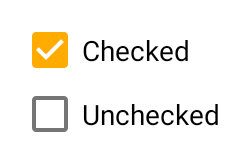
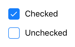
A check box widget.
| Constructor | public |
| Singleton | No |
| Namespace | tabris |
| Direct subclasses | None |
| JSX support | Element: <CheckBox/>Parent element: <Composite/> and any widget extending CompositeChild elements: None Text content: Sets text property |
Example
import {CheckBox, contentView} from 'tabris';

new CheckBox({text: 'Checkbox'})
  .onSelect(event => console.log(`Checkbox checked: ${event.checked}`))
  .appendTo(contentView);
See also:
JSX Creating a simple Checkbox
Constructor
new CheckBox(properties?)
| Parameter | Type | Optional | Description |
|---|---|---|---|
| properties | Properties<CheckBox> |
Yes | Sets all key-value pairs in the properties object as widget properties. |
Properties
checked
The checked state of the check box.
| Type | boolean |
| Default | false |
| Settable | Yes |
| Change events | Yes |
checkedTintColor
The color of the selectable area in checked state. Will fall back to tintColor if not set.
| Type | ColorValue |
| Settable | Yes |
| Change events | Yes |
font
The font used for the text.
| Type | FontValue |
| Settable | Yes |
| Change events | Yes |
text
The label text of the check box.
| Type | string |
| Settable | Yes |
| Change events | Yes |
| JSX content type | string |
When using CheckBox as an JSX element the element content is mapped to this property. Therefore
<CheckBox>Hello World</CheckBox>
has the same effect as:
<CheckBox text='Hello World' />
textColor
The color of the text.
| Type | ColorValue |
| Settable | Yes |
| Change events | Yes |
tintColor
The color of the selectable area.
| Type | ColorValue |
| Settable | Yes |
| Change events | Yes |
Events
select
Fired when the check box is checked or unchecked by the user.
| Parameter | Type | Description |
|---|---|---|
| checked | boolean |
The new value of checked. |
Change Events
checkedChanged
Fired when the checked property has changed.
| Parameter | Type | Description |
|---|---|---|
| value | boolean |
The new value of checked. |
textChanged
Fired when the text property has changed.
| Parameter | Type | Description |
|---|---|---|
| value | string |
The new value of text. |
textColorChanged
Fired when the textColor property has changed.
| Parameter | Type | Description |
|---|---|---|
| value | ColorValue |
The new value of textColor. |
tintColorChanged
Fired when the tintColor property has changed.
| Parameter | Type | Description |
|---|---|---|
| value | ColorValue |
The new value of tintColor. |
checkedTintColorChanged
Fired when the checkedTintColor property has changed.
| Parameter | Type | Description |
|---|---|---|
| value | ColorValue |
The new value of checkedTintColor. |
fontChanged
Fired when the font property has changed.
| Parameter | Type | Description |
|---|---|---|
| value | FontValue |
The new value of font. |