Class “Picker”
Object > NativeObject > Widget > Picker
A widget with a drop-down list of items to choose from.
| Constructor | public |
| Singleton | No |
| Namespace | tabris |
| Direct subclasses | None |
| JSX support | Element: <Picker/>Parent element: <Composite/> and any widget extending CompositeChild elements: None Text content: Not supported |
Example
import {contentView, Picker} from 'tabris';

const items = ['Apple', 'Banana', 'Cherry'];

new Picker({
  itemCount: items.length,
  itemText: index => items[index]
}).onSelect(event => console.log(`Selected ${items[event.index]}`))
  .appendTo(contentView);
See also:
JSX Creating a simple Picker
JSX picker-style.jsx
Constructor
new Picker(properties?)
| Parameter | Type | Optional | Description |
|---|---|---|---|
| properties | Properties<Picker> & Partial<Pick<Picker, 'itemText'>> |
Yes | Sets all key-value pairs in the properties object as widget properties. |
Methods
set(properties)
Sets all key-value pairs in the properties object as widget properties.
Important TypeScript note: When called on this you may need to specify your custom type like this: this.set<MyComponent>({propA: valueA});
| Parameter | Type | Optional | Description |
|---|---|---|---|
| properties | Properties<T> & Partial<Pick<this, 'itemText'>> |
No |
Returns this
Properties
borderColor
The color of the Picker border. This can be the surrounding line or the underline of the Picker depending on the style property.
| Type | ColorValue |
| Settable | Yes |
| Change events | Yes |
floatMessage
Android
Whether the hint message should float above the Picker when focus is gained.
| Type | boolean |
| Default | true |
| Settable | Yes |
| Change events | Yes |
font
The font used for the text inside the Picker.
| Type | FontValue |
| Settable | Yes |
| Change events | Yes |
itemCount
The number of items to display.
| Type | number |
| Settable | Yes |
| Change events | Yes |
itemText
A function that returns the string to display for a given index.
| Type | (index: number) => string |
| Settable | Yes |
| Change events | Yes |
message
A hint text that is displayed when the picker has no selection.
| Type | string |
| Settable | Yes |
| Change events | Yes |
selectionIndex
The index of the currently selected item.
| Type | number |
| Settable | Yes |
| Change events | Yes |
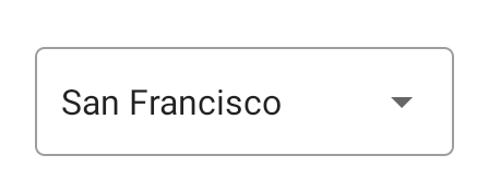
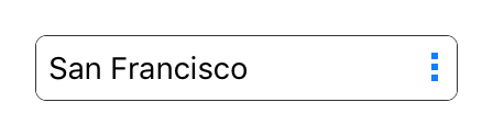
style
Android
The visual appearance of the Picker widget.
With the style outline, fill or underline the message hint will float above the Picker on Android. This behavior can be controlled with the property floatMessage. The style none will remove any background visualization, allowing to create a custom background.
| Type | 'default' | 'outline' | 'fill' | 'underline' | 'none' |
| Default | 'default' |
| Settable | On creation |
| Change events | No |
This property can only be set via constructor or JSX. Once set, it cannot change anymore.See also:
textColor
The color of the text.
| Type | ColorValue |
| Settable | Yes |
| Change events | Yes |
Events
select
Fired when an item was selected by the user.
| Parameter | Type | Description |
|---|---|---|
| index | number |
Contains the index of the selected item. |
Change Events
messageChanged
Fired when the message property has changed.
| Parameter | Type | Description |
|---|---|---|
| value | string |
The new value of message. |
floatMessageChanged
Fired when the floatMessage property has changed.
| Parameter | Type | Description |
|---|---|---|
| value | boolean |
The new value of floatMessage. |
itemCountChanged
Fired when the itemCount property has changed.
| Parameter | Type | Description |
|---|---|---|
| value | number |
The new value of itemCount. |
itemTextChanged
Fired when the itemText property has changed.
| Parameter | Type | Description |
|---|---|---|
| value | (index: number) => string |
The new value of itemText. |
selectionIndexChanged
Fired when the selectionIndex property has changed.
| Parameter | Type | Description |
|---|---|---|
| value | number |
The new value of selectionIndex. |
borderColorChanged
Fired when the borderColor property has changed.
| Parameter | Type | Description |
|---|---|---|
| value | ColorValue |
The new value of borderColor. |
textColorChanged
Fired when the textColor property has changed.
| Parameter | Type | Description |
|---|---|---|
| value | ColorValue |
The new value of textColor. |
fontChanged
Fired when the font property has changed.
| Parameter | Type | Description |
|---|---|---|
| value | FontValue |
The new value of font. |