Class “Slider”
Object > NativeObject > Widget > Slider
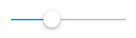
A widget representing a numeric value as an movable indicator on a horizontal line.

| Constructor | public |
| Singleton | No |
| Namespace | tabris |
| Direct subclasses | None |
| JSX support | Element: <Slider/>Parent element: <Composite/> and any widget extending CompositeChild elements: None Text content: Not supported |
Example
import {Slider, contentView} from 'tabris';

new Slider({
  left: 16, right: 16,
  selection: 50
}).onSelect(({selection}) => console.log(`Slider is at ${selection}`))
  .appendTo(contentView);
See also:
Constructor
new Slider(properties?)
| Parameter | Type | Optional | Description |
|---|---|---|---|
| properties | Properties<Slider> |
Yes | Sets all key-value pairs in the properties object as widget properties. |
Properties
maximum
The maximum value.
| Type | number |
| Default | 100 |
| Settable | Yes |
| Change events | Yes |
minimum
The minimum value.
| Type | number |
| Default | 0 |
| Settable | Yes |
| Change events | Yes |
selection
The actual value.
| Type | number |
| Default | 0 |
| Settable | Yes |
| Change events | Yes |
tintColor
The color used to display the current selection.
| Type | ColorValue |
| Settable | Yes |
| Change events | Yes |
Events
select
Fired when the selection property is changed by the user.
| Parameter | Type | Description |
|---|---|---|
| selection | number |
The new value of selection. |
Change Events
minimumChanged
Fired when the minimum property has changed.
| Parameter | Type | Description |
|---|---|---|
| value | number |
The new value of minimum. |
maximumChanged
Fired when the maximum property has changed.
| Parameter | Type | Description |
|---|---|---|
| value | number |
The new value of maximum. |
selectionChanged
Fired when the selection property has changed.
| Parameter | Type | Description |
|---|---|---|
| value | number |
The new value of selection. |
tintColorChanged
Fired when the tintColor property has changed.
| Parameter | Type | Description |
|---|---|---|
| value | ColorValue |
The new value of tintColor. |