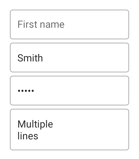
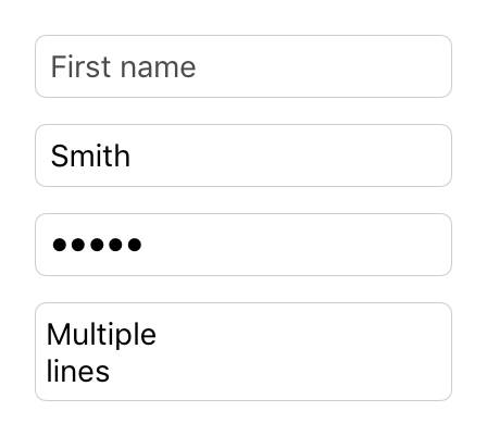
Class “TextInput”
Object > NativeObject > Widget > TextInput
A widget that allows to enter text.


| Constructor | public |
| Singleton | No |
| Namespace | tabris |
| Direct subclasses | None |
| JSX support | Element: <TextInput/>Parent element: <Composite/> and any widget extending CompositeChild elements: None Text content: Sets text property |
Example
import {TextInput, contentView} from 'tabris';

new TextInput({
  left: 16, right: 16,
  message: 'Name'
}).onInput(({text}) => console.log(`Text changed to ${text}`))
  .appendTo(contentView);
See also:
JSX Creating a simple TextInput
JS Handling selection on a TextInput
JSX Handling focus changes on a TextInput
JS Creating TextInputs with various enter key types
JS Creating TextInputs with various keyboards
JS Showing password in clear text on a TextInput
JSX A form using TextInput and other input controls
TSX textinput-focus.tsx
TS textinput-keyboard.ts
TSX textinput-style.tsx
Constructor
new TextInput(properties?)
| Parameter | Type | Optional | Description |
|---|---|---|---|
| properties | Properties<TextInput> |
Yes | Sets all key-value pairs in the properties object as widget properties. |
Properties
alignment
The horizontal alignment of the text.
| Type | 'left' | 'right' | 'centerX' |
| Default | 'left' |
| Settable | Yes |
| Change events | Yes |
autoCapitalize
Control how text input is capitalized.
none- Do not change any text inputsentence- Capitalize the first word of a sentenceword- Capitalize every wordall- Capitalize every letter
The boolean value false maps to none whereas true is equal to all.
| Type | true | false | none | sentence | word | all |
| Settable | Yes |
| Change events | Yes |
autoCorrect
Enables the spell checker and auto-correction feature.
| Type | boolean |
| Default | false |
| Settable | Yes |
| Change events | Yes |
borderColor
The color of the border of the TextInput. On iOS this is a rectangular border around the TextInput, on Android it is a single line below the TextInput.
| Type | ColorValue |
| Settable | Yes |
| Change events | Yes |
cursorColor
iOS
The color of the cursor in the TextInput.
| Type | ColorValue |
| Settable | Yes |
| Change events | Yes |
editable
Whether the text can be edited or not.
| Type | boolean |
| Default | true |
| Settable | Yes |
| Change events | Yes |
enterKeyType
Label or icon to display on the keyboard ‘confirmation’ key. The key press can be captured via the accept event. Setting an enterKeyType other than default will change the key behavior to not close the keyboard automatically. The developer is able close the keyboard by removing the focus from the TextInput.
| Type | 'default' | 'done' | 'next' | 'send' | 'search' | 'go' |
| Default | 'default' |
| Settable | Yes |
| Change events | Yes |
See also:
floatMessage
Android
Should the hint message float above the TextInput when focus is gained.
| Type | boolean |
| Default | true |
| Settable | Yes |
| Change events | Yes |
focused
Reflects whether this widget has the keyboard focus. Setting this property to true will focus the widget and open the virtual keyboard, setting it to false will remove the focus and hide the virtual keyboard.
| Type | boolean |
| Default | false |
| Settable | Yes |
| Change events | Yes |
font
The font used for the text.
| Type | FontValue |
| Settable | Yes |
| Change events | Yes |
keepFocus
When true the TextInput will keep its focus, even when tapped outside of the widget bounds.
| Type | boolean |
| Default | false |
| Settable | Yes |
| Change events | Yes |
keyboard
Selects the keyboard type to use for editing this widget. Has no effect when type is set to multiline.
| Type | 'ascii' | 'decimal' | 'email' | 'number' | 'numbersAndPunctuation' | 'phone' | 'url' | 'default' |
| Default | 'default' |
| Settable | Yes |
| Change events | Yes |
See also:
JS textinput-keyboard.js
TS textinput-keyboard.ts
message
A hint text that is displayed when the input field is empty. Does not apply on iOS when type is set to multiline.
| Type | string |
| Settable | Yes |
| Change events | Yes |
revealPassword
Makes the text visible when the TextInput has the type password.
| Type | boolean |
| Settable | Yes |
| Change events | Yes |
See also:
JS textinput-revealpassword.js
selection
The selection is a two element number array representing the text selections start and end position. The native platform usually shows selection handles so that the selection can be changed by the user. A selection array where both numbers are the same represent a single cursor at the given position. The selection start is the index of the first character where as the end is the index of the last character + 1. E.g. to select the word “ok” the selection would be [0, 2].
To make a selection visible the TextInput has to be in focus. Consequently the selection is preserved when the focus is lost and regained. When the user gives the TextInput focus by tapping on it, the selection is changed to represent his touch position.
Getting the selection upon user interaction (e.g. a button press) the focus would be lost and possibly the selection altered due to user interaction. In such a scenario it is recommended to set the keepFocus property to true.
| Type | number[] |
| Settable | Yes |
| Change events | Yes |
See also:
style
Android
The visual appearance of the text widget.
With the style outline, fill or underline the message hint will float above the TextInput on Android. This behavior can be controlled with the property floatMessage. The style none will remove any background visualization, allowing to create a custom background.
| Type | 'default' | 'outline' | 'fill' | 'underline' | 'none' |
| Default | 'default' |
| Settable | On creation |
| Change events | No |
This property can only be set via constructor or JSX. Once set, it cannot change anymore.See also:
text
The text in the input field.
| Type | string |
| Settable | Yes |
| Change events | Yes |
| JSX content type | string |
When using TextInput as an JSX element the element content is mapped to this property. Therefore
<TextInput>Hello World</TextInput>
has the same effect as:
<TextInput text='Hello World' />
textColor
The color of the text.
| Type | ColorValue |
| Settable | Yes |
| Change events | Yes |
type
The type of the text widget.
| Type | 'default' | 'password' | 'search' | 'multiline' |
| Default | 'default' |
| Settable | On creation |
| Change events | No |
This property can only be set via constructor or JSX. Once set, it cannot change anymore.
Events
accept
Fired when a text input has been finished by pressing the keyboard’s Enter key. The label of this key may vary depending on the platform and locale.
| Parameter | Type | Description |
|---|---|---|
| text | string |
The current value of text. |
select
The select event is fired when the user alters the text selection. Either by dragging the selection handles of a text selection, by moving the cursor inside the text or by typing which also advances the cursor.
The event also fires when the user taps inside a TextInput since this involves to set the cursor to the tapped position.
| Parameter | Type | Description |
|---|---|---|
| selection | number[] |
The current selection as a two element number array of start and end position. |
blur
Fired when the widget lost focus.
focus
Fired when the widget gains focus.
See also:
input
Fired when the text was changed by the user.
| Parameter | Type | Description |
|---|---|---|
| text | string |
The new value of text. |
Change Events
textChanged
Fired when the text property has changed.
| Parameter | Type | Description |
|---|---|---|
| value | string |
The new value of text. |
textColorChanged
Fired when the textColor property has changed.
| Parameter | Type | Description |
|---|---|---|
| value | ColorValue |
The new value of textColor. |
messageChanged
Fired when the message property has changed.
| Parameter | Type | Description |
|---|---|---|
| value | string |
The new value of message. |
editableChanged
Fired when the editable property has changed.
| Parameter | Type | Description |
|---|---|---|
| value | boolean |
The new value of editable. |
floatMessageChanged
Fired when the floatMessage property has changed.
| Parameter | Type | Description |
|---|---|---|
| value | boolean |
The new value of floatMessage. |
alignmentChanged
Fired when the alignment property has changed.
| Parameter | Type | Description |
|---|---|---|
| value | string |
The new value of alignment. |
autoCorrectChanged
Fired when the autoCorrect property has changed.
| Parameter | Type | Description |
|---|---|---|
| value | boolean |
The new value of autoCorrect. |
autoCapitalizeChanged
Fired when the autoCapitalize property has changed.
| Parameter | Type | Description |
|---|---|---|
| value | any |
The new value of autoCapitalize. |
keyboardChanged
Fired when the keyboard property has changed.
| Parameter | Type | Description |
|---|---|---|
| value | string |
The new value of keyboard. |
enterKeyTypeChanged
Fired when the enterKeyType property has changed.
| Parameter | Type | Description |
|---|---|---|
| value | string |
The new value of enterKeyType. |
focusedChanged
Fired when the focused property has changed.
| Parameter | Type | Description |
|---|---|---|
| value | boolean |
The new value of focused. |
keepFocusChanged
Fired when the keepFocus property has changed.
| Parameter | Type | Description |
|---|---|---|
| value | boolean |
The new value of keepFocus. |
borderColorChanged
Fired when the borderColor property has changed.
| Parameter | Type | Description |
|---|---|---|
| value | ColorValue |
The new value of borderColor. |
revealPasswordChanged
Fired when the revealPassword property has changed.
| Parameter | Type | Description |
|---|---|---|
| value | boolean |
The new value of revealPassword. |
cursorColorChanged
Fired when the cursorColor property has changed.
| Parameter | Type | Description |
|---|---|---|
| value | ColorValue |
The new value of cursorColor. |
selectionChanged
Fired when the selection property has changed.
| Parameter | Type | Description |
|---|---|---|
| value | number[] |
The new value of selection. |
fontChanged
Fired when the font property has changed.
| Parameter | Type | Description |
|---|---|---|
| value | FontValue |
The new value of font. |

