Class “NavigationView”
Object > NativeObject > Widget > Composite > NavigationView
A widget that displays a stack of pages with a toolbar that allows to navigate back. The toolbar also displays the current page’s title and the highest priority actions that are added to the NavigationView. Only children of type Page, Action and SearchAction are supported. Since the NavigationView does not compute its own size, the width and height must be defined by the respective layout properties (e.g. either width or left and right must be specified).
| TypeScript type | NavigationView<PageType extends Page = Page, ActionType extends Action = Action> extends Composite<PageType|ActionType> |
| Constructor | public |
| Singleton | No |
| Namespace | tabris |
| Direct subclasses | None |
| JSX support | Element: <NavigationView/>Parent element: <Composite/> and any widget extending CompositeChild elements: <PageType|ActionType/>Text content: Not supported |
Example
import {NavigationView, Page, contentView} from 'tabris';

new NavigationView({layoutData: 'stretch'})
  .append(new Page({title: 'Albums'}))
  .appendTo(contentView);
See also:
JSX Creating a simple NavigationView with pages
JSX Demonstrating a NavigationView with various interactive properties
JS Using multiple NavigationViews in TabFolder Tabs
JSX navigationview-action-placement.jsx
JSX navigationview-action.jsx
JSX navigationview-searchaction.jsx
Constructor
new NavigationView(properties?)
| Parameter | Type | Optional | Description |
|---|---|---|---|
| properties | Properties<NavigationView> |
Yes | Sets all key-value pairs in the properties object as widget properties. |
Methods
pages(selector?)
Returns the ordered list of pages on the page stack, with the bottommost page as the first and the topmost page as the last element. Same as children(), but only returns children that are of type Page.
| Parameter | Type | Optional | Description |
|---|---|---|---|
| selector | Selector |
Yes | A selector expression or a predicate function to filter the results. |
Returns WidgetCollection
pages(constructor)
Returns the ordered list of pages on the page stack, with the bottommost page as the first and the topmost page as the last element. Same as children(), but only accepts subclasses of Page.
| Parameter | Type | Optional | Description |
|---|---|---|---|
| constructor | { new (...args: any[]): U } |
No | A class to filter the results. |
Returns WidgetCollection<U>
Properties
actionColor
The color used for action icons.
| Type | ColorValue |
| Settable | Yes |
| Change events | Yes |
actionTextColor
Android
The color used for action texts. Only applied on Android, IOS uses the actionColor to colorize the action text.
| Type | ColorValue |
| Settable | Yes |
| Change events | Yes |
drawerActionVisible
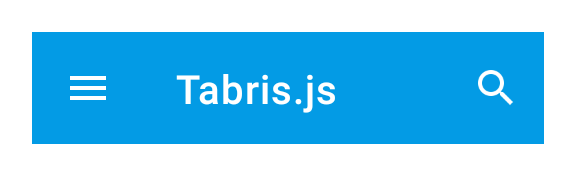
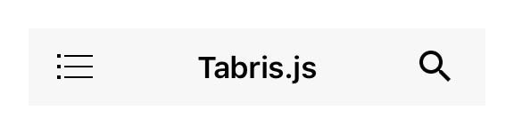
Whether to display the so-called “Burger menu” to open the drawer.
| Type | boolean |
| Settable | Yes |
| Change events | Yes |
pageAnimation
Controls what animation to use when animating a page transition.
| Type | 'default' | 'none' |
| Default | 'default' |
| Settable | Yes |
| Change events | Yes |
titleTextColor
The text color used for page titles.
| Type | ColorValue |
| Settable | Yes |
| Change events | Yes |
toolbarColor
The background color of the toolbar.
| Type | ColorValue |
| Settable | Yes |
| Change events | Yes |
toolbarHeight
The height of the toolbar. Is 0 if not visible.
| Type | number |
| Settable | Yes |
| Change events | Yes |
toolbarVisible
Whether the toolbar is visible.
| Type | boolean |
| Default | true |
| Settable | Yes |
| Change events | Yes |
Change Events
drawerActionVisibleChanged
Fired when the drawerActionVisible property has changed.
| Parameter | Type | Description |
|---|---|---|
| value | boolean |
The new value of drawerActionVisible. |
toolbarVisibleChanged
Fired when the toolbarVisible property has changed.
| Parameter | Type | Description |
|---|---|---|
| value | boolean |
The new value of toolbarVisible. |
toolbarColorChanged
Fired when the toolbarColor property has changed.
| Parameter | Type | Description |
|---|---|---|
| value | ColorValue |
The new value of toolbarColor. |
toolbarHeightChanged
Fired when the height of the toolbar changes, e.g. if it changes visibility.
| Parameter | Type | Description |
|---|---|---|
| value | number |
The new value of toolbarHeight. |
titleTextColorChanged
Fired when the titleTextColor property has changed.
| Parameter | Type | Description |
|---|---|---|
| value | ColorValue |
The new value of titleTextColor. |
actionColorChanged
Fired when the actionColor property has changed.
| Parameter | Type | Description |
|---|---|---|
| value | ColorValue |
The new value of actionColor. |
actionTextColorChanged
Fired when the actionTextColor property has changed.
| Parameter | Type | Description |
|---|---|---|
| value | ColorValue |
The new value of actionTextColor. |
pageAnimationChanged
Fired when the pageAnimation property has changed.
| Parameter | Type | Description |
|---|---|---|
| value | string |
The new value of pageAnimation. |