Class “ScrollView”
Object > NativeObject > Widget > Composite > ScrollView
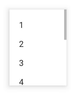
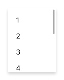
A composite that allows its content to overflow either vertically (default) or horizontally. Since the ScrollView does not compute its own size, the width and height must be defined by the respective layout properties (e.g. either width or left and right must be specified).


| Constructor | public |
| Singleton | No |
| Namespace | tabris |
| Direct subclasses | None |
| JSX support | Element: <ScrollView/>Parent element: <Composite/> and any widget extending CompositeChild elements: Widgets Text content: Not supported |
Example
import {ScrollView, TextView, contentView} from 'tabris';

const scrollView = new ScrollView({layoutData: 'stretch'})
  .appendTo(contentView);

new Textview({text: 'Scrollable content'}
  .appendTo(scrollView));
See also:
JSX Creating a simple ScrollView
JSX How to implement parallax scrolling with a ScrollView
Constructor
new ScrollView(properties?)
| Parameter | Type | Optional | Description |
|---|---|---|---|
| properties | Properties<ScrollView> |
Yes | Sets all key-value pairs in the properties object as widget properties. |
Methods
scrollToX(offset, options?)
Scrolls to the given horizontal offset. Give {animate: false} as the second parameter to suppress the animation.
| Parameter | Type | Optional | Description |
|---|---|---|---|
| offset | number |
No | The offset to scroll to in dip. |
| options | {animate?: boolean} |
Yes | An additional object to control the animation. Set to {animate: false} to scroll without an animation. |
Returns this
scrollToY(offset, options?)
Scrolls to the given vertical offset. Give {animate: false} as the second parameter to suppress the animation.
| Parameter | Type | Optional | Description |
|---|---|---|---|
| offset | number |
No | The offset to scroll to in dip. |
| options | {animate?: boolean} |
Yes | An additional object to control the animation. Set to {animate: false} to scroll without an animation. |
Returns this
Properties
direction
Specifies the scrolling direction of the scroll composite.
| Type | 'vertical' | 'horizontal' |
| Default | 'vertical' |
| Settable | On creation |
| Change events | No |
This property can only be set via constructor or JSX. Once set, it cannot change anymore.
offsetX
The horizontal scrolling position in dip.
| Type | number |
| Settable | No |
| Change events | Yes |
offsetY
The vertical scrolling position in dip.
| Type | number |
| Settable | No |
| Change events | Yes |
scrollXState
The scroll state of the ScrollView in horizontal direction. The following states are supported:
rest- no scrollingdragthe user moves theScrollViewcontent with his fingerscrollthe user has flinged the content with his finger or theScrollViewis scrolling programmatically
| Type | 'rest' | 'drag' | 'scroll' |
| Default | 'rest' |
| Settable | No |
| Change events | Yes |
scrollYState
The scroll state of the ScrollView in vertical direction. The following states are supported:
rest- no scrollingdragthe user moves theScrollViewcontent with his fingerscrollthe user has flinged theScrollViewcontent with his finger or theScrollViewis scrolling programmatically
| Type | 'rest' | 'drag' | 'scroll' |
| Default | 'rest' |
| Settable | No |
| Change events | Yes |
scrollbarVisible
Allows to show or hide scroll bar for current direction.
| Type | boolean |
| Default | true |
| Settable | Yes |
| Change events | Yes |
Events
scrollX
Fired while scrolling horizontally.
| Parameter | Type | Description |
|---|---|---|
| offset | number |
Indicates the current horizontal scrolling position. |
scrollY
Fired while scrolling vertically.
| Parameter | Type | Description |
|---|---|---|
| offset | number |
Indicates the current vertical scrolling position. |
Change Events
offsetXChanged
Fired when the offsetX property has changed.
| Parameter | Type | Description |
|---|---|---|
| value | number |
The new value of offsetX. |
offsetYChanged
Fired when the offsetY property has changed.
| Parameter | Type | Description |
|---|---|---|
| value | number |
The new value of offsetY. |
scrollbarVisibleChanged
Fired when the scrollbarVisible property has changed.
| Parameter | Type | Description |
|---|---|---|
| value | boolean |
The new value of scrollbarVisible. |
scrollXStateChanged
Fired when the scrollXState property has changed.
| Parameter | Type | Description |
|---|---|---|
| value | string |
The new value of scrollXState. |
scrollYStateChanged
Fired when the scrollYState property has changed.
| Parameter | Type | Description |
|---|---|---|
| value | string |
The new value of scrollYState. |

