Class “Button”
Object > NativeObject > Widget > Button
A push button. Can contain a text or an image.
| Constructor | public |
| Singleton | No |
| Namespace | tabris |
| Direct subclasses | None |
| JSX support | Element: <Button/>Parent element: <Composite/> and any widget extending CompositeChild elements: None Text content: Sets text property |
Example
import {Button, contentView} from 'tabris';

new Button({text: 'Save'})
  .onSelect(() => console.log('Button tapped'))
  .appendTo(contentView);
See also:
JSX Create a simple Button
JSX Create buttons with different styles
Constructor
new Button(properties?)
| Parameter | Type | Optional | Description |
|---|---|---|---|
| properties | Properties<Button> |
Yes | Sets all key-value pairs in the properties object as widget properties. |
Properties
alignment
The horizontal alignment of the button text.
| Type | 'left' | 'right' | 'centerX' |
| Default | 'centerX' |
| Settable | Yes |
| Change events | Yes |
font
The font used for the button text.
| Type | FontValue |
| Settable | Yes |
| Change events | Yes |
image
An image to be displayed on the button.
| Type | ImageValue |
| Settable | Yes |
| Change events | Yes |
strokeColor
Controls the line width of a button with the style outline.
| Type | ColorValue |
| Settable | Yes |
| Change events | Yes |
strokeWidth
Controls the line color of a button with the style outline.
| Type | number |
| Settable | Yes |
| Change events | Yes |
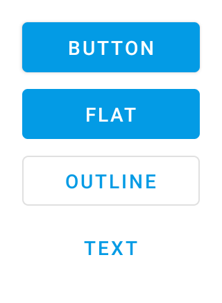
style
The style controls the appearance of a Button and has to be provided in its constructor. The default style creates a platform specific button, which is flat on iOS and has an elevation and shadow on Android. In addition the following specific style values can be used:
elevateA button with a platform specific background color, elevation and a surrounding drop shadow. Only supported on AndroidflatA button with no elevation and a platform specific background coloroutlineA button with a transparent background and an outline stroke which can be controlled via the propertiesstrokeWidthandstrokeColortextA button with no background and only consisting of its text label.
| Type | 'default' | 'elevate' | 'flat' | 'outline' | 'text' |
| Default | 'default' |
| Settable | On creation |
| Change events | No |
This property can only be set via constructor or JSX. Once set, it cannot change anymore.See also:
text
The button’s label text.
| Type | string |
| Settable | Yes |
| Change events | Yes |
| JSX content type | string |
When using Button as an JSX element the element content is mapped to this property. Therefore
<Button>Hello World</Button>
has the same effect as:
<Button text='Hello World' />
textColor
The color of the text.
| Type | ColorValue |
| Settable | Yes |
| Change events | Yes |
Events
select
Fired when the button is pressed.
Change Events
strokeColorChanged
Fired when the strokeColor property has changed.
| Parameter | Type | Description |
|---|---|---|
| value | ColorValue |
The new value of strokeColor. |
strokeWidthChanged
Fired when the strokeWidth property has changed.
| Parameter | Type | Description |
|---|---|---|
| value | number |
The new value of strokeWidth. |
alignmentChanged
Fired when the alignment property has changed.
| Parameter | Type | Description |
|---|---|---|
| value | string |
The new value of alignment. |
fontChanged
Fired when the font property has changed.
| Parameter | Type | Description |
|---|---|---|
| value | FontValue |
The new value of font. |
imageChanged
Fired when the image property has changed.
| Parameter | Type | Description |
|---|---|---|
| value | ImageValue |
The new value of image. |
textChanged
Fired when the text property has changed.
| Parameter | Type | Description |
|---|---|---|
| value | string |
The new value of text. |
textColorChanged
Fired when the textColor property has changed.
| Parameter | Type | Description |
|---|---|---|
| value | ColorValue |
The new value of textColor. |